
Kiddom Website Redesign: Standards Pages
Company: Kiddom
Role: Designer and Illustrator
Educational standards are grade-specific learning goals for students. The standards pages on the Kiddom website had a high volume of organic traffic but a low conversion rate. We wanted the redesign to increase conversions and also better communicate how educators can use Kiddom to teach and track standards.

Standards Landing Page
As a first touchpoint for site visitors coming from organic search, the redesign provides opportunities to sign up for a free teacher account or request a demo for the paid version of the product. Common core standards are presented in a carousel by subject, so visitors can quickly find the standards that interest them. Wireframes and prototypes were created to organize and define page hierarchy and user flow and were used in presentations to internal stakeholders. New illustrations, icons, and SVG animations were created to show the aspirational, diverse, and fun qualities of the Kiddom brand.
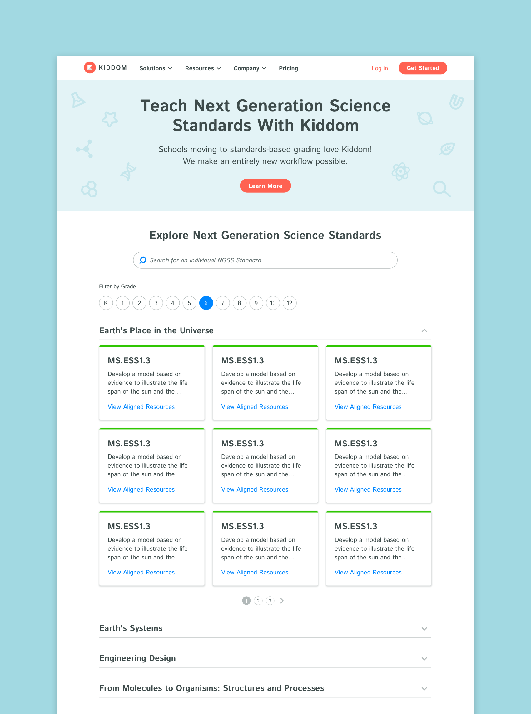
Standards Group and Grade Pages
Pages were created for each common core standard group. These pages contain a search bar allowing visitors to search for a specific standard. The grade filter produces category results that can be expanded to view all standards within that category. Text links on standards cards lead users to viewing standards-aligned teaching resources.
Information about Kiddom with a CTA to learn more is included on this page since site visitors could land on this page first through organic search.
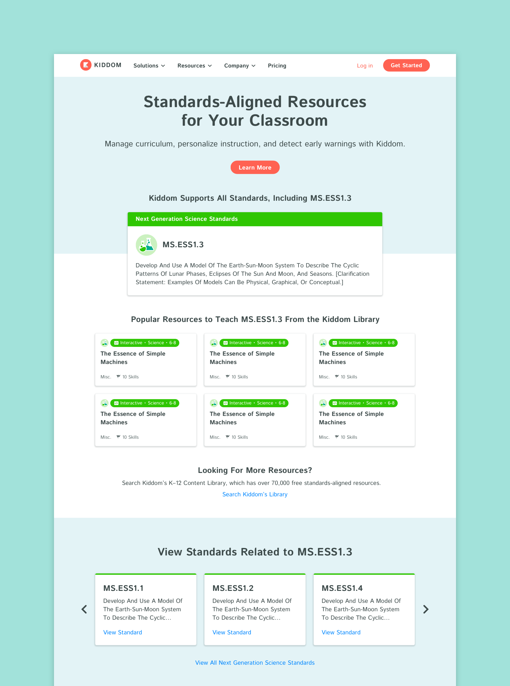
Individual Standards Pages
Individual standards pages were created for each standard. Site visitors could land on these pages if they were searching for standard specific resources, making it essential to include information about Kiddom. The resource cards are an entry point into the product, leading visitors to the Kiddom Content Library, where there would be more opportunities to convert.
Kiddom Website Redesign: Homepage
Homepage redesign to include new product messaging and product pillars: Manage Curriculum, Personalize Learning and See Early Warnings. The update also included customer logos, social proof, and a persona section for teachers, students, families, and admins with new opportunities to convert. New illustrations and icons were created to reflect the updated messaging and personas.
Hero illustration by Ryan Brock


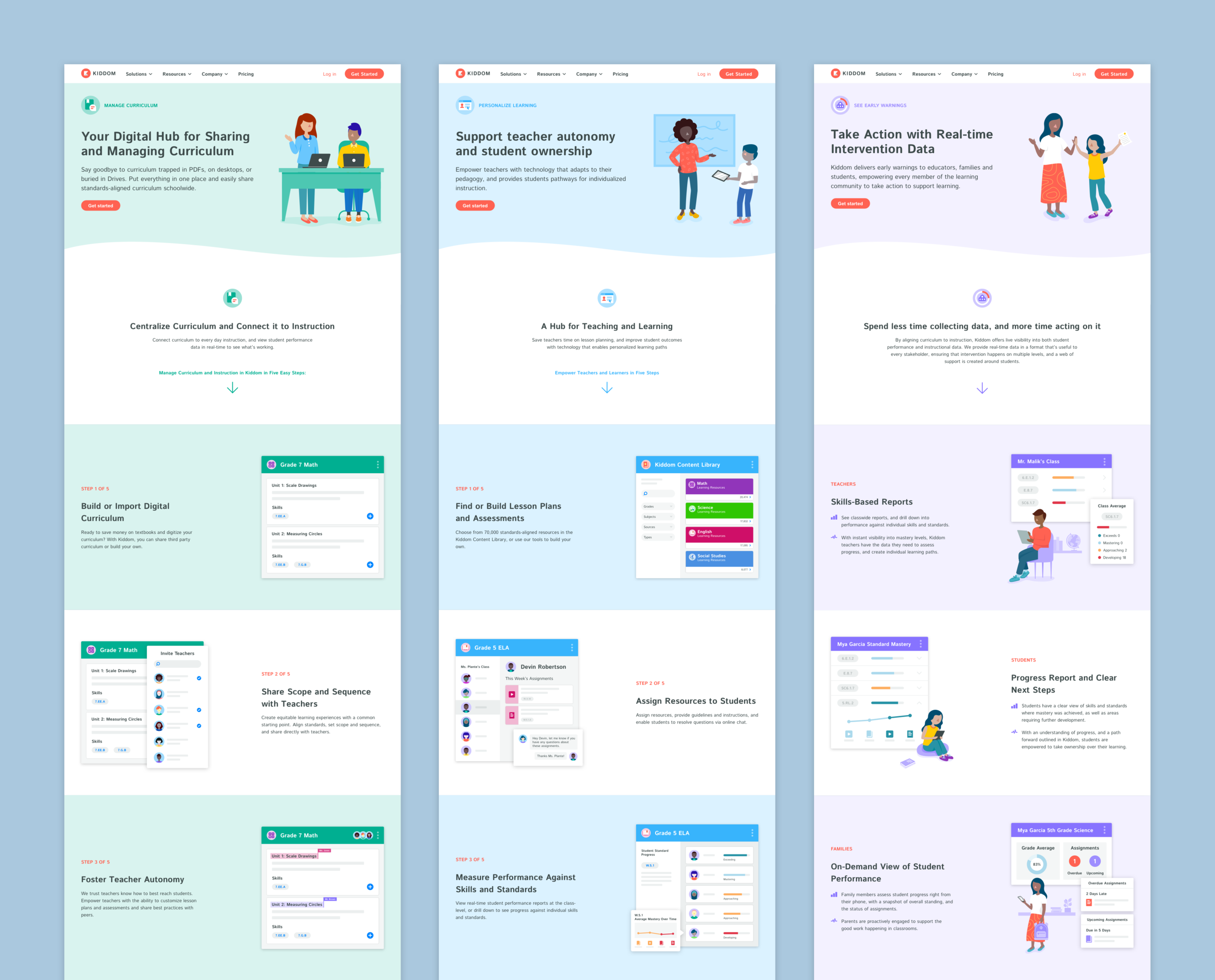
Kiddom Website Redesign: Product Pillar Pages
New product pages to show Kiddom’s unique combination of curriculum management, personalized learning, and real-time intervention data. In addition to updating the product messaging, we also had the goal of increasing conversion rates. There was a tight deadline for these pages, so to be mindful of design and engineering time, we created a template to use for all three pages.
New brand illustrations were created to convey that Kiddom is made for everyone in the education community. Simplified UI illustrations were created to show workflows and communicate the depth and range of the product in an easily digestible way.


Kiddom Website Redesign: Pricing Page
The Kiddom website didn’t have a pricing page, so we needed to make one. The goals for this project were to show the different plans Kiddom offers and communicate what is included in each tier and increase conversions. The new partnership with Open Up Resources also needed to be highlighted. Hover tooltips were created to give visitors more information on features.
New illustrations were created to show the value of the different plans. New icons were created to illustrate the implementation services Kiddom offers.


